Hello,
Welcome to the website block system. This system provides a flexible set of content blocks that we will use to construct your web pages. On this page you will see some visual examples of the blocks with some basic information that will share the best use case scenarios and practices for website layout and design.
As you create content, it’s important to always keep the user in mind. Begin sections with a clear introduction so visitors immediately understand what they’re looking at. Don’t make them work to figure out your message. Focus on clarity, relevance, and accessibility.
To enhance both user experience and search engine visibility, use keywords that your audience is likely to search for. Avoid duplicating content across the site. If similar information needs to appear in multiple places, rephrase it so that search engines recognize it as unique. This not only improves SEO but also ensures your content feels fresh and purposeful wherever it appears. By following these best practices, you’ll create a more intuitive, engaging, and effective website.
When writing for character count, keep in mind that Long words can disrupt clean text wrapping, especially in narrow layouts like mobile screens and multi-column desktop sections. If two phrases have a similar character count, the one with longer words is more likely to break awkwardly or leave uneven spacing. This can lead to the need for editing or rephrasing text to ensure it fits cleanly within the available space.
For example, a phrases like “Sensor integration in autonomous navigation systems is critical” includes long, technical terms. These words can force line breaks that will push copy down to the next line, create gaps, and spacing issues. In contrast, a simpler sentence like “Robots use maps to move and avoid obstacles” uses shorter words that wrap more naturally.
As this is in Alpha phase, please share your feedback and suggestions that will help others. Thanks!
Do not forget we are always here to HELP!!!
Topper Block 1
Topper Block

Notes about the block
- This should only be used at the top of the page and never more than once on the page.
- This should only be used in one column.
- Make sure to match the image size otherwise you might get adverse effects.
- Try to mix this up with the 3-D Topper (Topper Block Version 2) throughout your website to create some variety on your pages.
- This component should feature only traditional photography. Avoid using collages, logos, icons, or any text elements within this photo block.
Topper Block Version 1
Style Tip: This is the 3D TOPPER without the following box selected.
Communicator Tips:
- Maximum Header Character Count with spaces: 26 (this can be longer if body copy is not maximum length)
- Maximum Body Character Count with spaces: 460 (this can be longer if header copy is not maximum length)
- Character Count Tool >>
- Example: https://matter-systems.gatech.edu/research-overview
A photoshop template is available below so you can size your image appropriately in addition to a placeholder image if you still need to find a photo.
Topper 2
Topper Block

Notes about the block
- This should only be used at the top of the page and never more than once on the page.
- This should only be used in one column.
- If the 3D box is flush with the top and bottom or the image or extends past the top and bottom of the image cut copy until it is smaller than the image.
- Make sure to match the image size otherwise you might get adverse effects.
- Try to mix this up with the Flat Topper (Topper Block Version 1) throughout your website to create some variety on your pages.
- This component should feature only traditional photography. Avoid using collages, logos, icons, or any text elements within this photo block.
Topper Block Version 2
Style Tip: This is 3D TOPPER
Communicator Tips:
- Maximum Header Character Count with spaces: 33 (this can be longer if body copy is not maximum length)
- Maximum Body Character Count with spaces: 300 (this can be longer if header copy is not maximum length)
- Character Count Tool >>
- Example: https://matter-systems.gatech.edu/core-facilities
A photoshop template is available below so you can size your image appropriately in addition to a placeholder image if you still need to find a photo.
Copy with Heading
Topper Block

Notes about the block
- This block should be used for the main intro copy for a page or a section of a page.
Main Header with Intro Copy
Style Tip: This is the Copy with Heading. This has the image applied and no rule. This also has an image placed below the into copy
Communicator Tips:
- Maximum Header Character Count with spaces: 36
- Maximum Body Character Count with spaces: 900
- Character Count Tool >>
- Example: https://matter-systems.research.gatech.edu/instructional-labs
If you create the photo from a file you have, here is a psd file and for position only file as a png to download:
Copy with Heading 2
Topper Block
Notes about the block
- This can be used to break up your page with alternating gold and white colors when you have multiple sections of copy.
- If you have overview copy with sub sections, use Copy with Heading 1 setting for the main copy and sub items under the section should be set with no image and the rule added. The user guide page you are on is an example of that treatment.
Alternating Section Headers
Style Tip: This is the Copy with Heading with the image applied and the rule.
Communicator Tips:
- Maximum Header Character Count with spaces: 36
- Maximum Body Character Count with spaces: 900
- Character Count Tool >>
- Example: https://matter-systems.research.gatech.edu/use-our-facilities
Call Out Block
Topper Block
Call Out Block
One Column Usage. Not for large amounts of information. Truly to call out something on the page or footer.
Communicator Tips:
- Generally not used with an image
- Maximum Header Character Count with spaces: 50
- Maximum Body Character Count with spaces: 350
- Character Count Tool >>
- Examples: https://matter-systems.gatech.edu/our-mission,
- https://ai.gatech.edu/education
Call To Action Block
Topper Block
Call to Action Block
One column usage. For calling out something with an image, title and body.
Communicator Tips:
- You can add a link as well as a YouTube video link. You can also alternate the image to align right and left.
- Maximum Header Character Count with spaces: 90 (this can be longer if body copy is not maximum length)
- Maximum Body Character Count with spaces: 400 (this can be longer if header copy is not maximum length and the block doesn't have a button for a link)
- Character Count Tool >>
- Examples: https://matter-systems.gatech.edu/use-our-facilities
If you create the photo from a file you have, here is a psd file and for position only file as a png to download:
Image with Copy Block
Topper Block

Notes about the block
- Blocks should remain 1 color when used in a grid. Select gold or white for IRI sites.
- When used in a grid of multiple blocks, these blocks should have a drop shadow.
- When used with image to the left or right of the copy, these blocks should not have the drop shadow.
- When writing copy for a grid of these block, try to keep headers and body copy similar in length.
Image with Copy Block
This block can be used in 1, 2, or 3 column set up.
Communicator Tip: You can choose for the image to be at the top, left, or right. You can also add a drop shadow or leave it simple. You can also add a link.
Examples:
- https://matter-systems.gatech.edu/use-our-facilities
- https://matter-systems.gatech.edu/k-12-resources
If you create the photo from a file you have, here is a psd file and for position only file as a png to download:

Notes about the block
- Blocks should remain 1 color when used in a grid. Select gold or white for IRI sites.
- When used in a grid of multiple blocks, these blocks should have a drop shadow.
- When writing copy for a grid of these block, try to keep headers and body copy similar in length.
Image with Copy Block
- This is how you can use this block without an image.
- This also shows the use of the drop-shadow feature and link.
- You should use this block more for 2 or 3 column needs
- You can use for one column but than you need to use a more horizontal type image
- You can choose three styles Light Gold, White, or Transparent - for a Background color
- Sometimes the best choice is no drop-shadow (wink wink)
Choose Image Left or Right
Notes about the block
- This block can be uses with images alternating from right to left, all images on the right, or all images on the left.
- When used with image to the left or right of the copy, these blocks should not have the drop shadow.
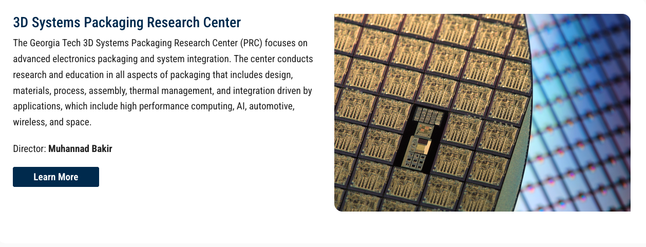
Image with Copy Block
- You can use this block to have in image to the left or right side of the content.
- You can also choose a light gold background color and or to use the drop-shadow
Examples:
https://matter-systems.gatech.edu/research-centers
If you create the photo from a file you have, here is a psd file and for position only file as a png to download:
- Photoshop File 4:3 ratio
- PNG File 4:3 ratio
Large Button Block
Topper Block
Notes about the block
- This should never be used as 1 button.
Large Button Block
It is best if this block can be used in 2, 3, or 4 column set up. Depending upon the word copy sizing. This is for when a group of links are the best choice.
Character Count for 2 column: 28
Character Count for 3 column: 20
Character Count for 4 column: 15
Examples:
Pull Quote Block
Topper Block
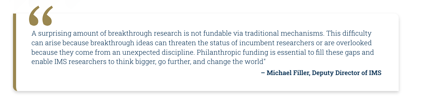
Pull Quote Block
This should not be used much. However, it is a great add for the right time. Generally used in 1 or 2 column, nothing smaller.
Character Count with Spaces: 400
Example:
https://matter-systems.gatech.edu/support-institute-matter-and-systems
By the Numbers Block
Topper Block
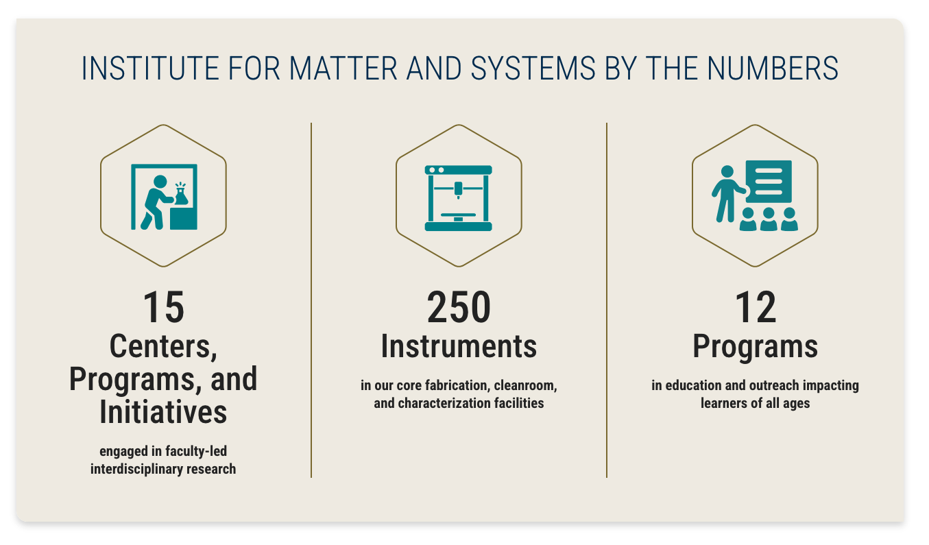


Notes about the block
- Three or four numbers can be highlighted. The icon for the first number in a four number layout is a featured number and larger than the bottom three.
- Templates are provided for creating icons and contain guides to help you size the icons within the hexagon. We have included bounding guides and guides to center your icon. When selecting icons, look for icons that are square to best fill the space. Save an .ai document in case you need to make changes later and export a .png for placing on the website.
- Three different types of copy are needed for this block. Try to be consistent with all three types of copy including the number, the unit, and unit description. If you have unit descriptions, try to have them for all numbers. See the example.
- Icons should be Olympic Teal (HEX: #008C95)
By the Numbers Block
- You must have content for 2 blocks of numbers.
- There is the possibility of 4 blocks for numbers but no more
- You might need to have graphics created. Submit a Design Ticket for that.
- Maximum Number Character Count with spaces: 10
- Maximum Unit Character Count with Spaces: 26
- Maximum Unit Description Character Count with spaces: 66
An illustrator file is available below so you can size your image appropriately in addition to a placeholder image if you still need to find an icon.
Icon Grid Blocks (custom)
Topper Block
Notes about the block
- Templates are provided for creating icons and contain guides to help you size the icons. We have included bounding guides and guides to center your icon. When selecting icons, look for icons that are horizontal to best fill the space. Save an .ai document in case you need to make changes later and export a .png for placing on the website.
- The color for the icons should be Olympic Teal (HEX: #008C95).
Icon Grid Blocks (custom)
- This is a custom block. Developers will need to build this block out.
- You can choose to use this on your website. Please follow character guidelines for content.
- You might need to have graphics created. Submit a Design Ticket for that.
Character Count with Spaces: 260
An illustrator file is available below so you can size your image appropriately in addition to a placeholder image if you still need to find an icon.
Icon Grid Block Template File
Icon Grid Block placement image
Accordion Block
Topper Block
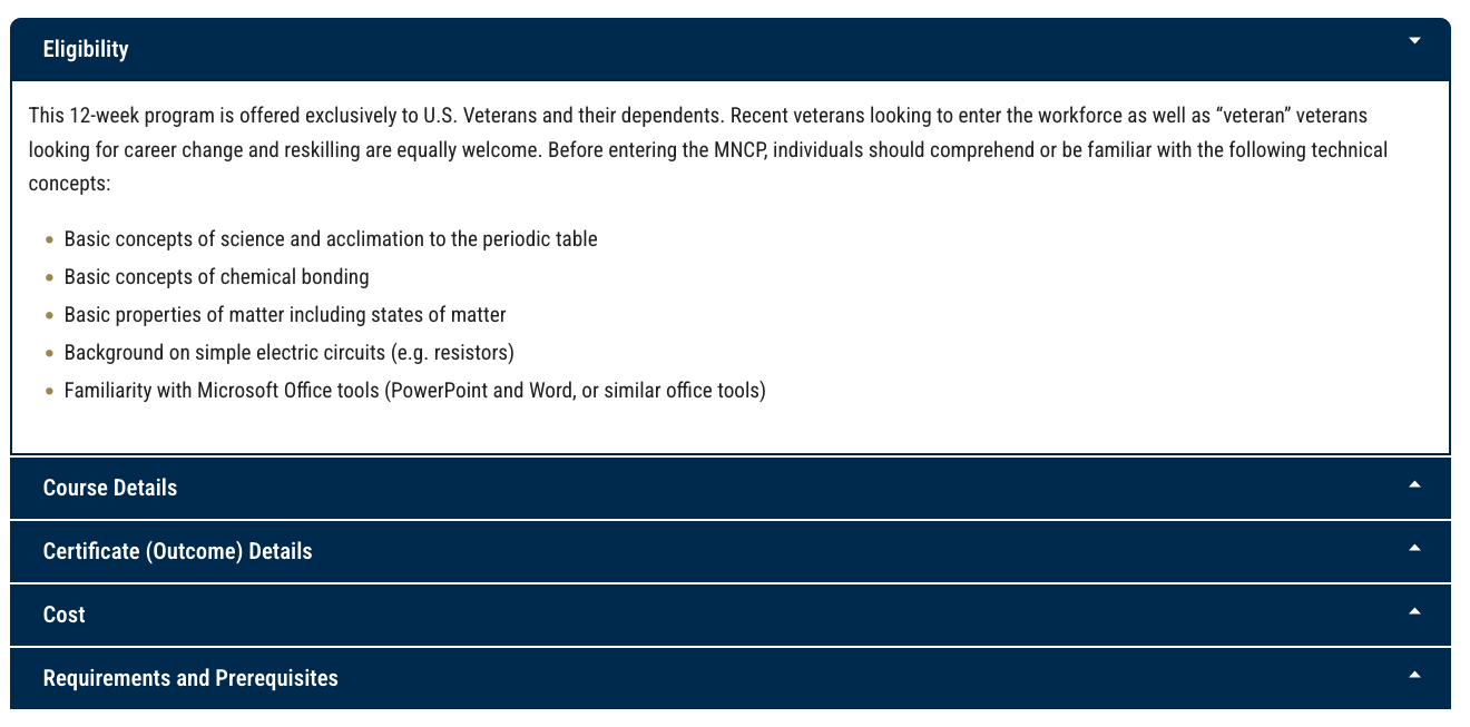
Accordion Block
- Use this block when there is way too much information for many things.
- Do not overuse accordions in your pages. They should only be used when there is not a more visually appealing option.
Timeline
Topper Block
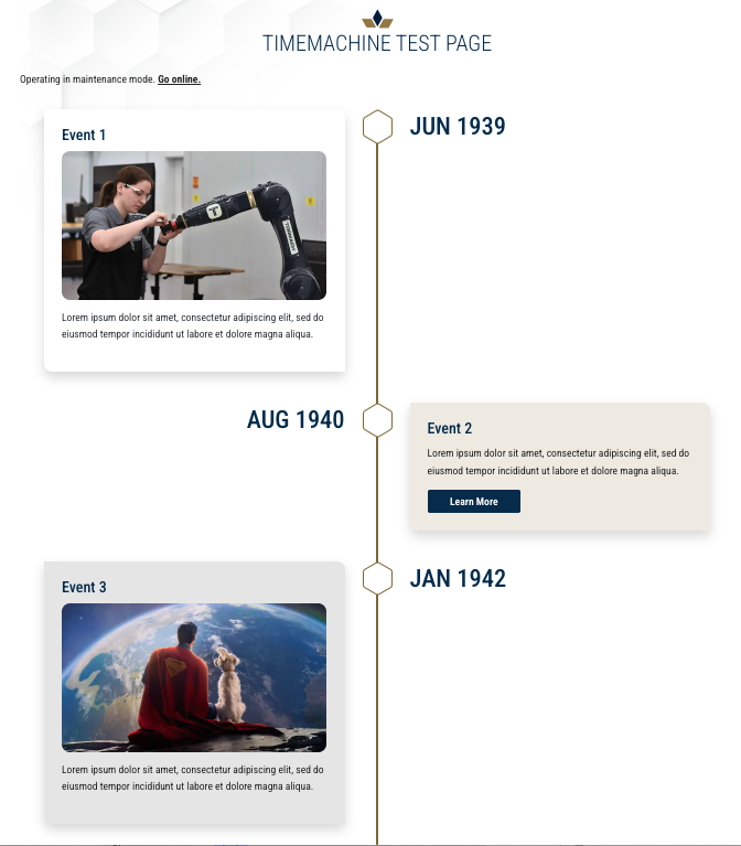
Topper Block
Notes about the block
- Dates should be formatted with three letters for the month and the year (Jan 1976). If you need a more specific date, please work it into the body copy.
Time Line (Custom)
- This is a custom block. Developers will need to build this block out.
- You can choose to use this on your website. Please follow character guidelines for content.
- Each individual block can have a link, image, or video if needed.
Maximum Header Character Count with Spaces: 76
Maximum Body Character Count with Spaces: 350